| Share |  |
 | |||
Pictures Too High: Common Mistake
 I recently visited an office in a professional office complex and was reminded of a common decorating mistake-- all the pictures were hung way too high. As my eyes scanned the room, the pictures looked as if they were hung by a seven-foot-tall individual who had an affinity for the ceiling—because the pictures on every wall were just inches away from the ceiling with nothing below or large gaping spaces between the pictures and the tables or chairs below.
It doesn’t take an expert to know this is not right. My mother took several interior decorating courses and shared with me some common guidelines to decorating that I’ve always tried to employ. I hope this will be helpful to you, too, and maybe cause a lot less neck-straining!
Eye Level
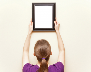
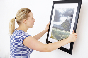
Hanging pictures or other types of wall decor too high or using pictures that are too small for a particular spot are perhaps the most common decorating mistakes. Experts agree that wall decor should generally be hung so that the middle of the picture (or grouping) is at eye level (from either a standing or sitting position, depending on where it will be viewed from) or a little (2 to 3 inches) lower than eye level, with spacing between pictures fairly equal or visually balanced.
We visited someone’s home several years ago and they had just moved in and decorated themselves. It looked as if they stretched their arms over their heads and held the hammer and nail up as high as they could reach and decided that was where the picture should go.
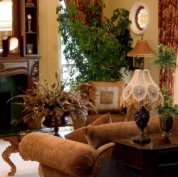
 Eye-level is always better. There are also a few other things to keep in mind. My mom always told me, “Don’t hang a picture without something under it.” Otherwise, it’s not grounded or anchored, it’s suspended or hanging in mid-air. So, I’ve tried to find small tables or chairs, even plants that can anchor the wall-décor. Of course, there can be exceptions, such as groupings in hallways, but even then, a wall table may be a possible option.
In Proportion
Pictures should also be hung in a way that is proportional to their location. A single small picture hung over a sofa will not look right. Neither will two small ones spread too far apart. They will be out of balance.
As a rule of thumb, artwork should be placed no more than five to nine inches above a sofa and no more than seven to ten inches above a table. The placement of your artwork should also relate to its surroundings. As a guideline for proportion, one or more pictures (including mirrors or other wall decor) should cover about 2/3 of the wall space above the piece of furniture. For example, if you have a 6 foot wide sofa, plan on a single picture or an arrangement that is about 4 feet wide and centered above the sofa.
 Groupings in Symmetry or Asymmetry
Always experiment with different arrangements and combinations of pictures before starting to hang any of them. There are two ways to arrange pictures: Symmetrical and asymmetrical. Symmetrical groupings create a more formal feeling while asymmetrical arrangements are more casual. Items that are the same or similar in size, shape, and/or other attributes lend themselves to symmetrical arrangements -- one in which items are hung equally around a center line or point. It is easier to create balance with a symmetrical grouping, but it is not difficult to balance an asymmetrical grouping either, although you'll have to rely on a bit of trial and error to create visual balance instead of a level and ruler or tape measure.
A grouping of pieces different in size, shape, color or other attributes will work better in an asymmetrical arrangement. Such a grouping should be hung so that the visual weight of the objects appears balanced. One way to do this without making a lot of unnecessary holes in your wall is to lay out the arrangement on the floor first, adjusting the grouping until you have arranged the items in the most pleasing (least lop-sided) way.
Bear in mind that a vertical arrangement makes a room appear taller and a horizontal arrangement makes it look wider. You might also want to consider hanging one larger item surrounded by a circle or rectangular arrangement of smaller pictures. This type of arrangement is particularly effective for displaying a group of photos on a hallway wall.
With these helpful hints you’ll have some tools to make your interior space as pleasing as you want it to be!
Copyright © 2008-2015 Debbie Reynolds Harper
Post Your Comment...
|
|
||||||||||||